Microsoft Forms
Accessing Microsoft Forms
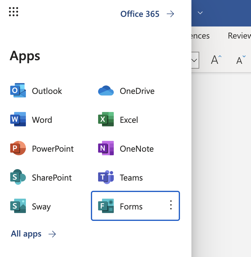
To access Microsoft Forms, click (or use your keyboard to tab to and use the spacebar or Enter key to open) the App Launcher button in the top left corner of any Office 365 app. Visually, this button looks like a three-by-three grid of dots. If you’re using assistive technology, the name of the button is “App Launcher”. Next, select the Forms option in the list of apps.
Adding a Title and Description
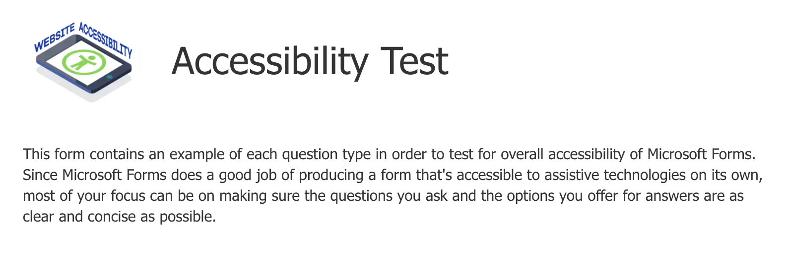
It’s good practice to add a short description of the form at the top of the page, under the Title. Important information about certain fields can be added here, along with a general summary of the form’s purpose and what a user can expect after submitting it.
Who can submit the form and view responses?
Since Microsoft Forms does a good job of producing a form that's technically accessible to assistive technologies on its own, most of your focus can be on making sure the questions you ask and the options you offer for answers are as clear and concise as possible. The fields for Name and Email address are not necessary, since a user needs to log in with their student email address in order to fill out the form and that information will automatically be included with their submission. If you choose to open a form up for anyone to submit, you would need to collect their name and email address in the form.
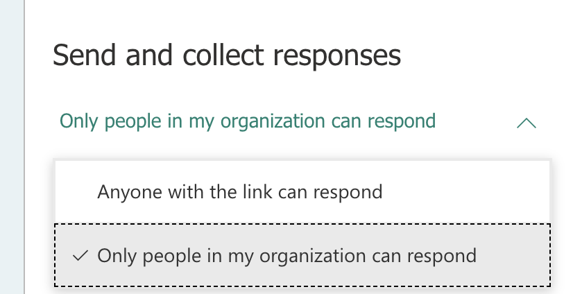
To change who can fill out your form, click the Share button and in the Send and collect responses section, choose between the two options in the select box. If you choose “Only people in my organization can respond”, users will need to enter their myCommNet information before being able to fill out the form. If you choose “Anyone with the link can respond”, you can share the link with anybody – regardless of their status as a student, faculty or staff member at the college – and they can fill out the form.
Note: you cannot allow anyone outside the CSCU system to submit a form when a File upload question is present on the form.
Images
While it is possible to add an image to each question, it isn’t recommended unless it’s really necessary. If it is, make sure to add alternative text. Alt text for images is limited to 128 characters, including spaces.
To add or edit alternative text, click on the image and then click on the pencil icon overlay. Enter the alternative text in the field that appears.
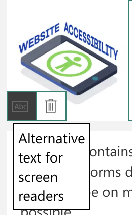
If the image includes a lot of text that exceeds 128 characters, use a subtitle instead since it will automatically be read by a screen reader and will be easier to read visually than text embedded in an image.
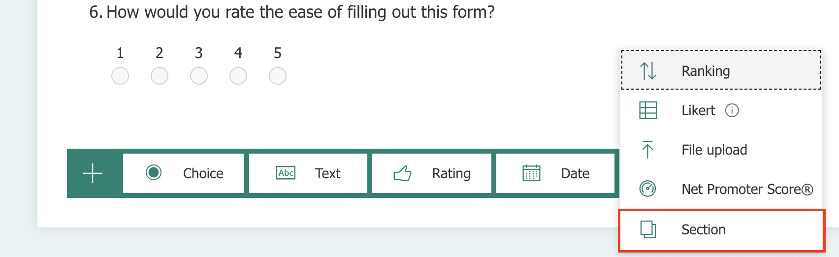
Sections
Try to break long forms into separate sections, with relevant questions grouped together into smaller chunks. This benefits everybody, but especially those who have difficulty focusing on large forms or get easily overwhelmed.
Questions with multiple answers
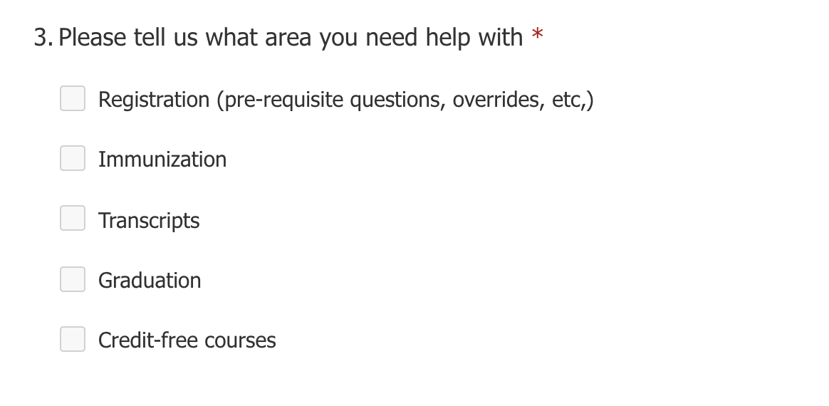
Questions that have multiple options are easier to fill out as radio buttons or checkboxes instead of a dropdown list. A dropdown list is only necessary if there are many options. For example, a list of 195 countries would work better in a dropdown list, while most other smaller lists (like the example below) would be better as radio button group (if only one answer can be chosen) or checkboxes (if multiple answers can be chosen). To switch between radio buttons and checkboxes, toggle the “Multiple answers” option when adding or editing a Choice question type.
Descriptive questions
Short but descriptive labels (or “Questions” in Microsoft Forms) are an important aspect of a form. The user needs to know what to enter into the text field, or what option to select in a list of radio buttons or checkboxes, or why they are being asked to choose a date. You can also add a Subtitle to each question, but make sure to only add one if it’s necessary to include additional details or instructions with a question. Screen reader users will hear all the information related to a field, whether it’s in the main question or the subtitle. However, do not make it overly verbose. A screen reader user will need to listen to the whole subtitle from beginning to end without being able to pause it, so make sure it’s as clear and concise as possible.
Note: file upload type inputs do not read the question correctly to screen reader users in the current version of Microsoft Forms.
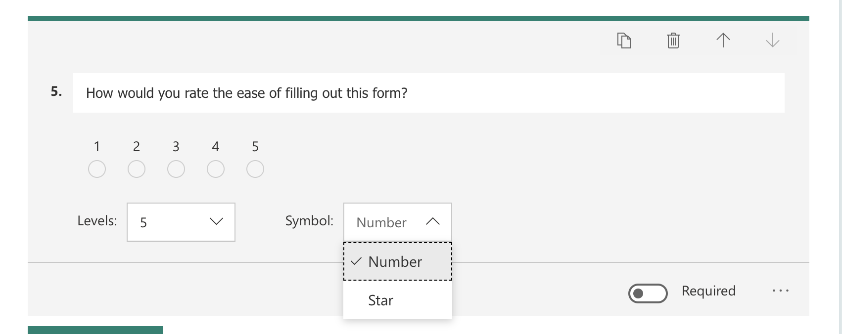
The Ratings question type
Instead of the Star symbol, it’s recommended to instead use radio buttons with an option for each score. Selecting a radio button is more straightforward for users. This can be achieved in Microsoft Forms by choosing the Number option in the Symbol choice instead of Stars when creating a Rating question.
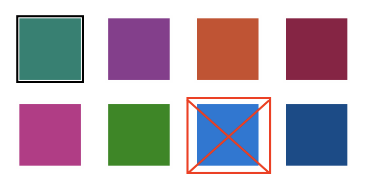
Customizing the Theme
When choosing the color for your form’s Theme, try to stick to the colors provided by Microsoft. All of them except for Bright Blue (important: do not use the Bright Blue color option) have sufficient contrast with white text. If you do want to use your own color, make sure it has at least 4.5:1 contrast ratio with white text before applying it to your form. You can use the WebAIM Contrast Checker tool to do this.